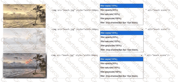
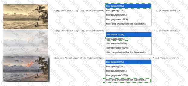
The first image has a brown/yellow vintage tone, which indicates the sepia(100%) CSS filter. Sepia converts the image colors into a warm monochrome effect commonly associated with aged photographs. The second image appears faded and washed out while retaining the same general image content, which corresponds to opacity(30%); this makes the image mostly transparent, allowing only 30 percent opacity. The third image shows the original beach image with a visible shadow offset behind it, so the correct filter is drop-shadow(8px 8px 10px black). The first two 8px values define the horizontal and vertical shadow offset, 10px defines the blur radius, and black defines the shadow color. saturate(100%) would leave saturation at its normal level and would not visibly create a special effect. grayscale(100%) would remove color entirely and produce a black-and-white image, which is not shown in the visible rows. References/topics: CSS filter property, image effects, sepia(), opacity(), drop-shadow(), graphical enhancement with CSS.
Contribute your Thoughts:
Chosen Answer:
This is a voting comment (?). You can switch to a simple comment. It is better to Upvote an existing comment if you don't have anything to add.


Submit