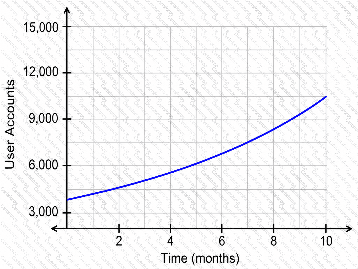
The graph represents the number of user accounts over time.
The horizontal axis represents:
" Time in months "
The vertical axis represents:
" Number of user accounts "
We need to find when the number of user accounts reached:
4,500
On the vertical axis, 4,500is halfway between:
3,000
and
6,000
So we look for the point where the blue curve reaches that height.
From the graph, the curve reaches approximately 4,500user accounts at:
x≈2.0
That means the website had about 4,500user accounts after approximately:
2.0 " months "
Contribute your Thoughts:
Chosen Answer:
This is a voting comment (?). You can switch to a simple comment. It is better to Upvote an existing comment if you don't have anything to add.
Submit