We can very much blend multiple measures into a single axis. Such charts are called Combined-Axis / Blended-Axis charts. Follow along:
Measures can share a single axis so that all the marks are shown in a single pane. To blend multiple measures, drag one measure or axis and drop it onto an existing axis.
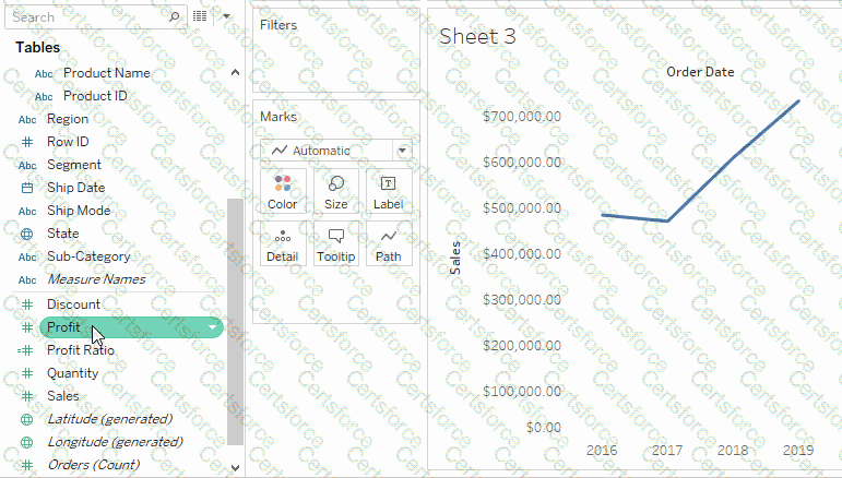
Instead of adding rows and columns to the view, when you blend measures there is a single row or column and all of the values for each measure is shown along one continuous axis. For example, the view below shows quarterly sales and profit on a shared axis.
Note: If you drag a measure on to the canvas and only see a single ruler indicator instead of the double ruler indicator shown below, Tableau creates dual axes instead of a blended axis. For more information about how to create dual axes, see Compare two measures using dual axes.
Chosen Answer:
This is a voting comment (?). You can switch to a simple comment. It is better to Upvote an existing comment if you don't have anything to add.
Submit