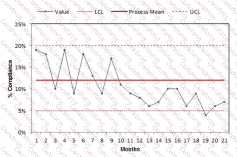
A statistical process control (SPC) chart, such as a control chart, is used to monitor process performance over time, distinguishing between common-cause variation (inherent to the process) and special-cause variation (due to specific factors). In this scenario, the SPC chart tracks compliance with a revised medication reconciliation process over 21 months. According to NAHQ CPHQ study materials, interpreting an SPC chart involves analyzing trends, shifts, and patterns within the data points relative to the control limits and centerline (mean).
Since the chart is not provided, I’ll consider a typical scenario for a performance improvement context. The question implies the performance improvement coordinator is evaluating long-term performance, and the options suggest looking for trends or changes in compliance. Option D, “There is an increasing trend toward compliance in recent months,” aligns with a common SPC chart interpretation where a trend is identified by a consistent direction in data points over time. In SPC terms, an increasing trend is often defined as six or more consecutive points moving upward, indicating a positive shift in the process (e.g., improved compliance). This interpretation is reasonable for a 21-month period where recent months show improvement, suggesting the revised process is gaining traction.
Option A, “The data indicate compliance has decreased,” would require a downward trend or a shift below the centerline with special-cause variation, which is less likely if the process has been in place for 21 months and improvements are expected. Option B, “The data are inconclusive, and additional monitoring is required,” would apply if the chart shows random variation within control limits with no clear trend or shift, but this is less actionable for a performance improvement coordinator evaluating a mature process. Option C, “The number of compliant clinicians has increased,” is too specific, as the chart likely measures overall compliance rates (e.g., percentage of compliant reconciliations), not individual clinician counts. NAHQ emphasizes identifying trends in SPC charts to guide improvement actions, making option D the most likely conclusion if recent months show an upward trend.
[Reference: NAHQ CPHQ Study Guide, Performance and Process Improvement Section, “Statistical Process Control and Control Chart Interpretation”; NAHQ CPHQ Practice Exam, Quality Monitoring Tools., , , , ]
Submit