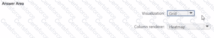
In Microsoft Sentinel workbooks , when you want to display query results in a tabular format and visually emphasize numeric values through color intensity (such as counts or frequencies), you use the Grid visualization type combined with the Heatmap column renderer .
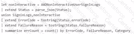
In this scenario, the query aggregates failed sign-in events from SigninLogs and AADNonInteractiveUserSignInLogs , summar izing them by ErrorCode , FailureReason , and Category with a calculated count ( errCount ). The errCount column holds numeric data that indicates how many times each unique failure pattern occurred.
To visually represent the severity or frequency of these cou nts, you configure:
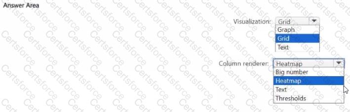
Visualization = Grid — Displays tabular data in a workbook. It’s the standard view type for showing multiple columns of query output (such as error codes and counts).
Column renderer = Heatmap — Applies a gradient color scheme to the se lected numeric column ( errCount ) so that higher values are highlighted with darker or more intense colors, making patterns or anomalies easier to spot.
Microsoft Sentinel workbook documentation explains:
“Heatmap rendering can be applied to numerical colum ns in Grid visualizations to provide color-coded representation of value ranges.”
Alternative renderers like Text or Big number do not provide dynamic color intensity, and Thresholds are used for conditional formatting rather than continuous color gradient s.
✅ Final configuration:
Submit